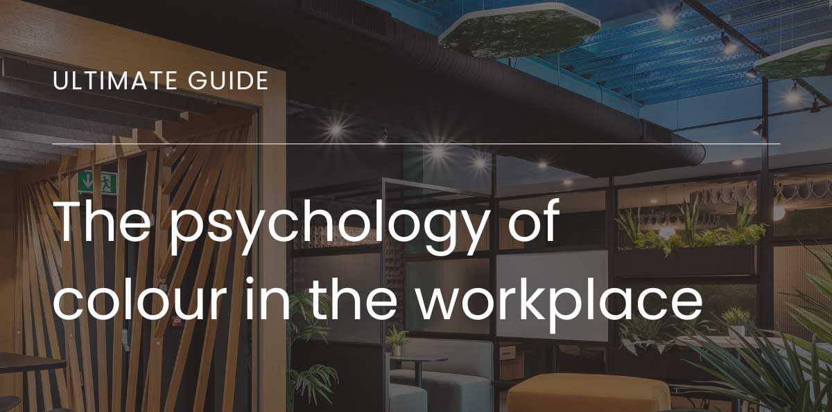
Could a more considered office refresh actually lead to more concrete benefits for businesses, and the people working within their four walls? The psychology of colour is a hot topic of discussion during the design process, so we’re here with our Ultimate guide into colour in the workplace.
At Ultimate, office interior design is where our skills and passions come together – whether that’s the latest trends in the built environment, the freshest aesthetic approaches to colour and form, or the practicalities of realising a creative vision in an achievable and efficient way.
Right now, there’s no more relevant topic than the psychology of colour, and how creative interior choices could impact everything from staff retention to productivity and profit.
Here’s how…
Think zonally
Start by thinking about what your office space needs to achieve. Is your team engaged in the same task, with the same ways of working (like a customer contact centre, or a sales floor)?
Or do you need separate zones for distinct tasks? Perhaps meeting and collaboration spaces, areas for welfare and relaxation, and focussed productivity zones.
This can be a complicated task if you’re in the middle of an office renovation project, of course. Because there are all kinds of other factors at place, from space requirements to noise and environmental factors. So it always helps to consult an office interiors specialist – our people are here to help!
Define your boundaries
Once you’ve planned out what you want to achieve, it’s time to set some boundaries and must-haves. If your brand identity is heavily reliant on colour, then there might be value in incorporating it into your interior design, for example, but that doesn’t mean you need walls, floors, desks and chairs in the same shade.
The same goes for any colours that simply can’t feature, whether because of the brand equity present from a competitor, or because of any functional requirements of your space. If a meeting room will be used for regular video calls, for example, then the colour chosen needs to offer clarity and contrast on screen.
Choose your mood
Now you’ve worked out exactly what your space needs to do, and your colours must haves and no gos, you can dive into the psychologically fascinating world of colour theory. Because choosing the right shade for the right objective has the potential to seriously upgrade your workspace.
Blue or green… for calm and harmony
If you’re designing a space that needs to turn down the volume, slow down the pace or encourage consensus, then blue or green shades offer just the psychological trick you need. Both colours bring strong, calming associations with the natural world, especially when paired with elements like planting and natural light from outside. Green especially causes lower eye fatigue, and blue can bring a sense of openness and space thanks to its association with the sea and sky.
Perfect for… meeting rooms, chillout zones and offices with a long and steady workflow.
Yellow or red… for action and stimulation
Both colours offer a route into decision making, though with subtle differences. Yellow is a creative, dynamic colour that lightens rooms and brings natural associations with warmth and sunshine. Red, on the other hand, can be very powerful in short bursts, stimulating quick, creative thought and encouraging action and debate. Red’s excitement and danger could be just the ticket in disruptive, innovative businesses.
Perfect for… breakout spaces, brainstorm areas, creative studios and fast paced environments.
Purple or metallic… for weight and status
Sometimes your space needs to say something important, whether that’s because your business relates to an impactful or professional sector, or because emphasising legacy and stability will help win new customers. That’s where purple comes in. Darker shades promote passion and drive, and it’s been a traditional colour of royalty and leadership for centuries. Deeper metallic shades, used sparingly, can achieve a similar effect too.
Perfect for… entrance areas, board rooms and businesses wishing to emphasise longevity.
White or grey… for simplicity and minimalism
Where work and people need to shine through, whether that’s via presentation areas or spaces with a product focus, white or grey could be the choice. Just because both colours lack a vibrant profile, it doesn’t mean their psychological effects are lacking. The clean and clinical impression white brings could be just right for minimal, creative spaces, with associations around wholeness, safety and integrity.
Perfect for… simpler spaces, showcase areas and businesses who need work to shine through.
Looking for a helping hand defining your space, and choosing the right colours for your office refit? We can help.


